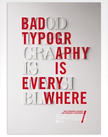
Typography
Traditionally defined as the art of process of setting, arranging, and designing type.
It is the glue that holds a design together, control emotions, tells stories not just with words but with design and style of the type.
It is the glue that holds a design together, control emotions, tells stories not just with words but with design and style of the type.
|
IT IS INFLUENCED BY technological advances and culture
(political, social, academic, artistic, etc).
|
History of Type
Timeline of key events in type history (Roman Alphabet).
Pre-700 CE
Type has evolved from one-of-a-kind handwritten scripts to printed technologies; its evolution is influenced by technological advances and culture (political, social, academic, artistic, etc). Looking far back in our history beginning as early as 38,000 BCE we can see the start of visual communicative markings in caves, on stone tablets, on papyrus and papers, through digital means.
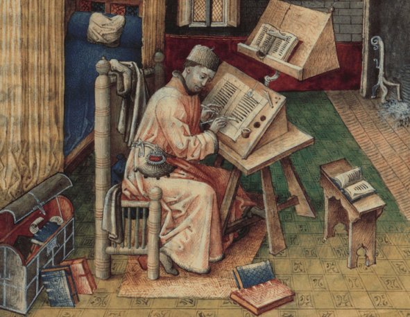
Book scribe creating a copy of a book.
|
In the beginning scribes would make manual copies of original texts. This process of reproduction was very time intensive and errors could occur.
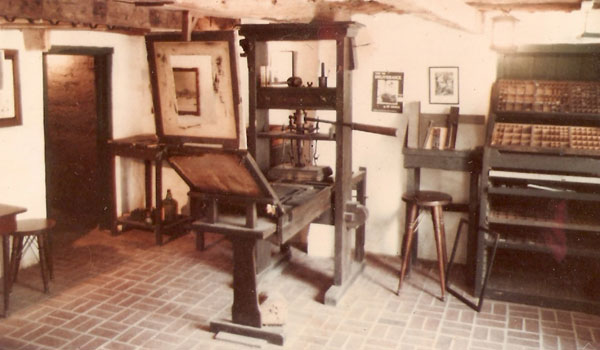
Woodblock printing techniques, were developed around 700 CE. by the Chinese which sped up the process of reproducing works; the first printed book was a Buddhist text called the Diamond Sutra published by Wang Jie in 868 CE. Early movable type began around 1040 CE (Song Dynasty) porcelain-like movable type had been used by Bi Sheng. Two-hundred years later during the Goryeo Dynasty in Korea that the first metal moveable type printing system was developed. This led to the Jikji, the earliest known movable metal type printed book in 1377. Neither of these caught on because of the enormous amount of labor involved in producing the letterforms - block printing remained the primary production method. |
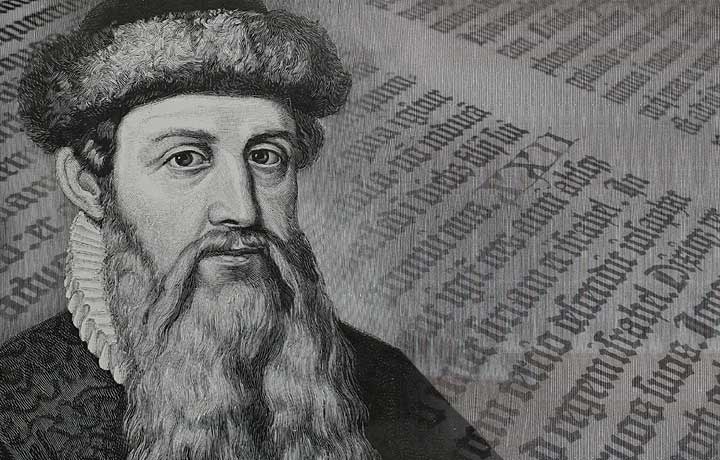
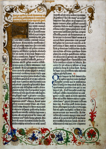
1440s - Johannes Gutenberg, German
|
|
|
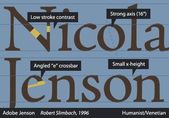
1470 - Nicolas Jenson, French
|
|
|
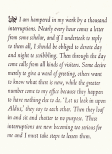
1501 - Aldus Manutius, italian
|
|
|

Serif
|
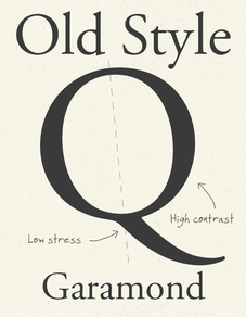
Old Style
|
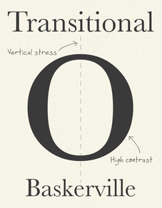
Transitional
|
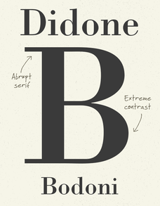
Modern
|
Slab
|
1734, William Caslon (English)
|
1757, John Baskerville (English)
|
1780, Didot (French) and Bodoni (Italian)
|
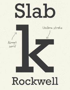
1815, Vincent Figgins (British)
|
Sans Serif
|
Grotesque or Gothic
|
Humanist
|
Geometric
|
Caslon1816 - William Caslon IV, English
|
|
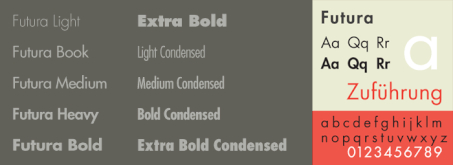
1920s - Paul Renner, German
|
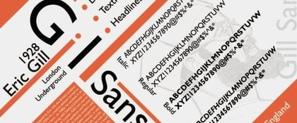
1920s - Eric Gill, English
|
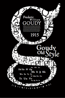
1920s - Frederic Goudy, American
|
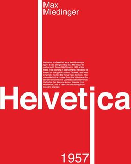
1957 - Max Miedinger, Swiss
|
Other
|
Script Type
|
Calligraphic Scripts
|
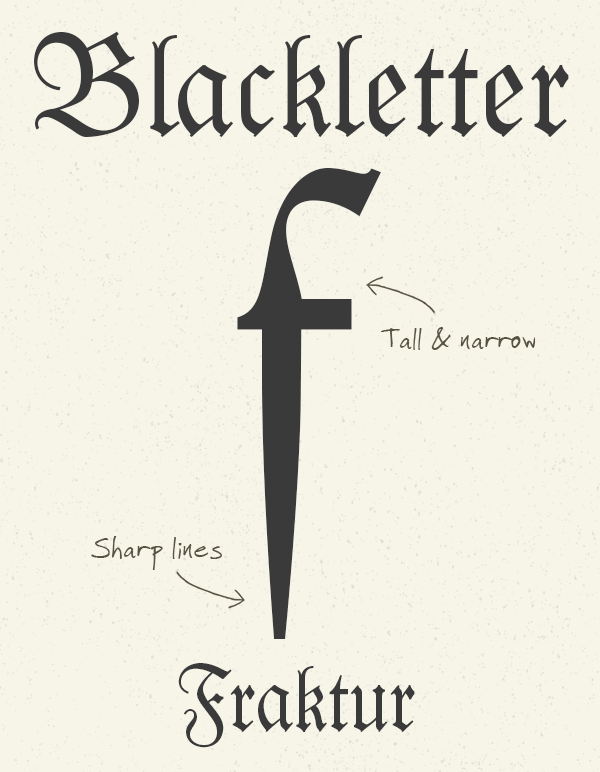
Blackletter & Lombardic
|
Casual Scripts
|
Decorative Type
|
Present Day
Enter the computer age where the possibilities are endless!
|
Pixel
|

Adobe
|

Apple & Microsoft
|

Adobe & Microsoft
|
Resources
|
|
| ||